February 2022 - September 2022
|
During my work at SupportLogic, I contributed to several projects related to the core product for Customer Support Managers and satellite products targeting CS engineers and agents.
|

CASE STUDY #1
Case Review Flow for CS Managers
|
Role
Sr Product Designer Users CS Team Managers of IT companies Problem Statement While the new case review functionality was still in beta, SupportLogic selectively rolled it out to a subset of its clients. Remarkably, these clients made extensive use of the feature, prompting multiple requests for enhancements. This surge in interest was driven by the significant challenges that users encountered while utilizing the functionality. |

|
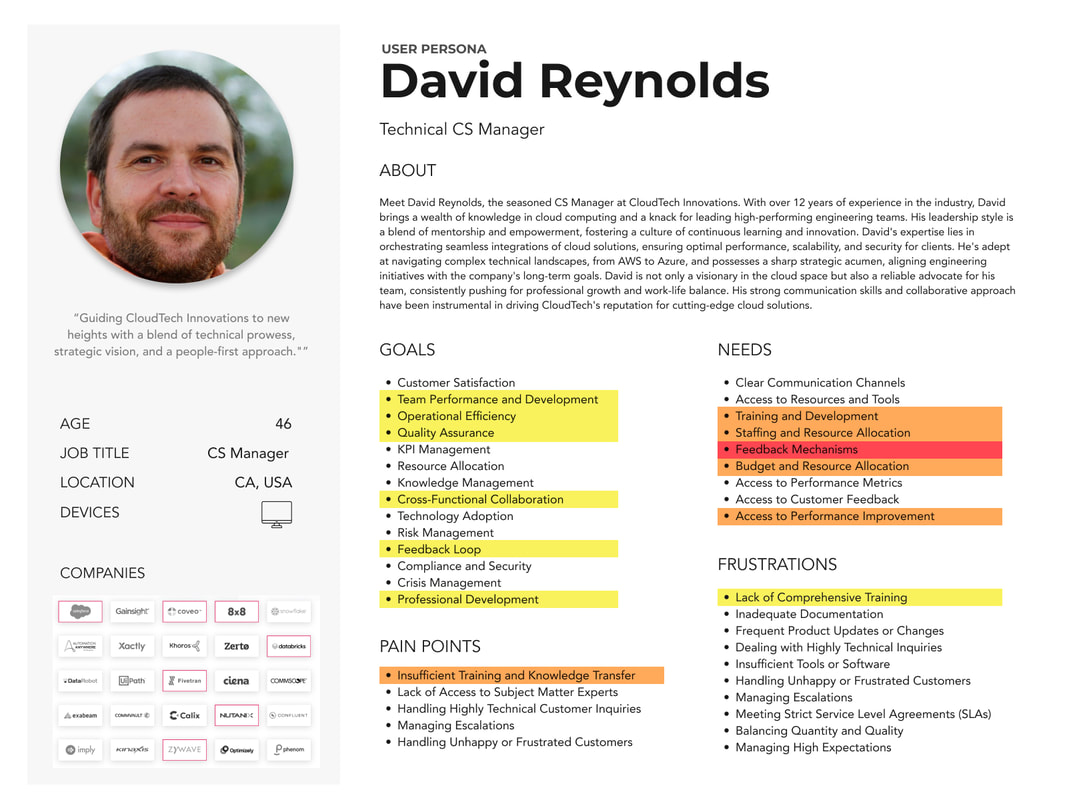
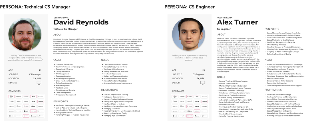
|
Research Phase
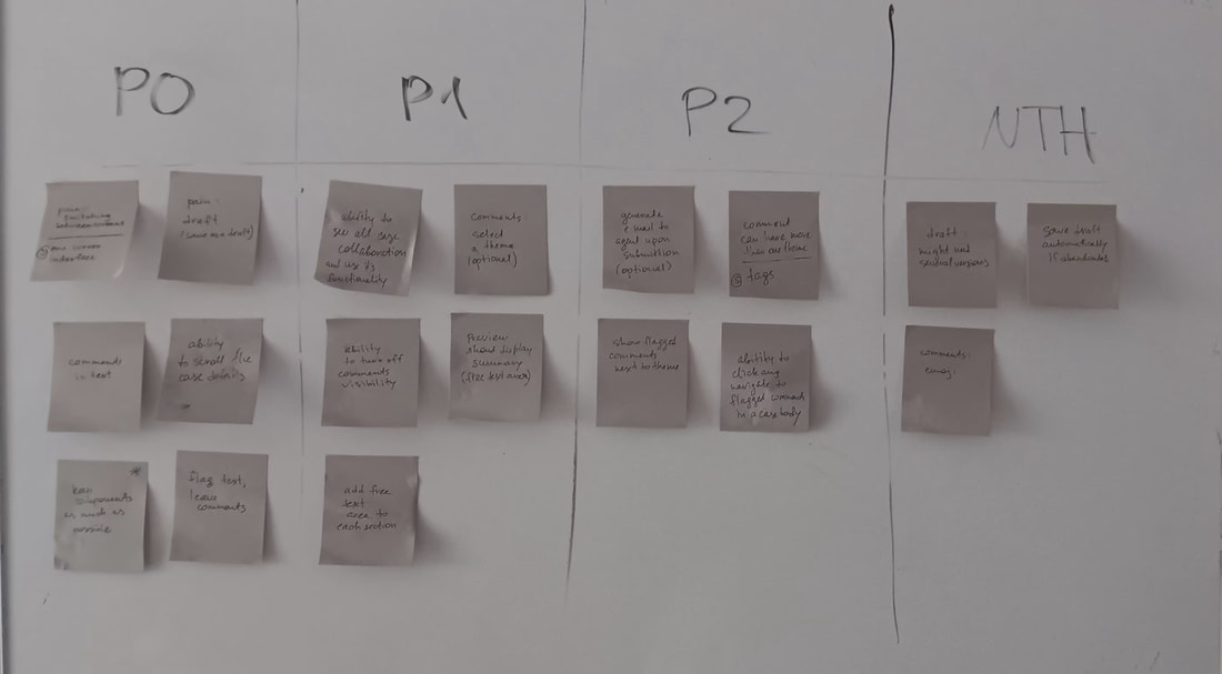
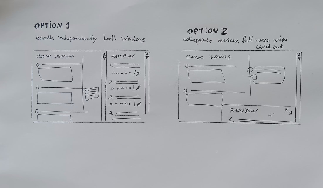
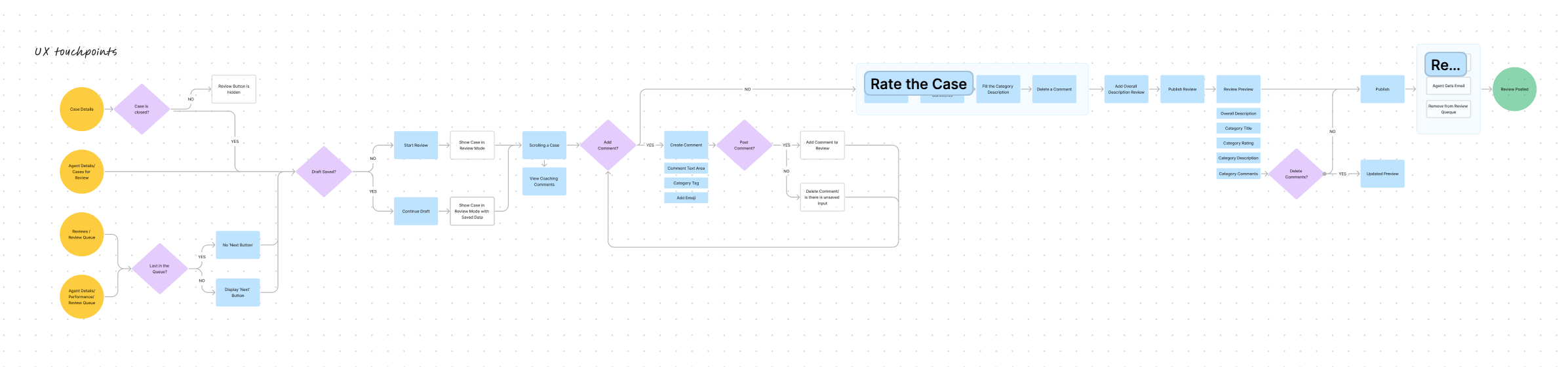
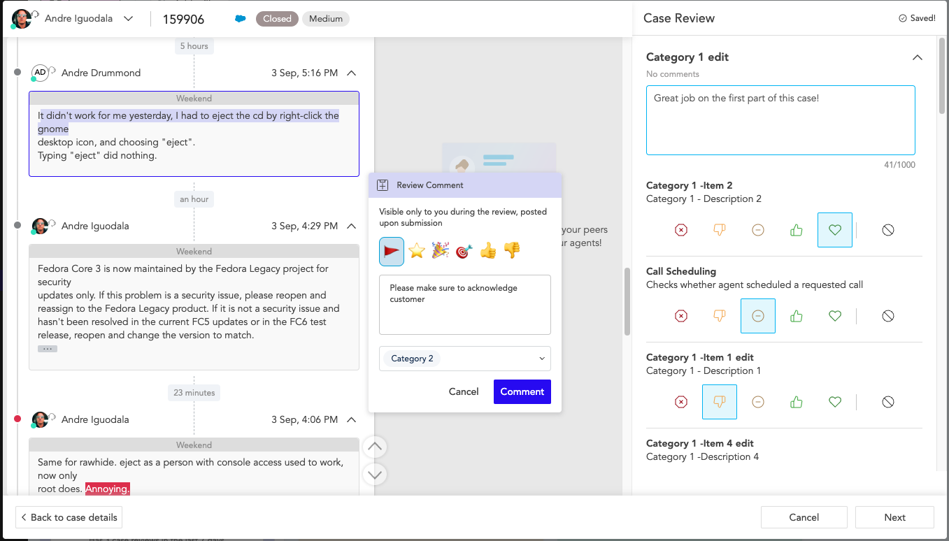
The startup had a good understanding of who their users were and had close relationships with their clients; however, since nobody identified personas before, I started creating persona profiles. It helped identify primary and secondary users for a project using storytelling and aligning product team members. To ensure a targeted approach, I highlighted the persona's attributes that directly pertain to the functionality. The problem focused on the 'feedback' stage within the user journey. Then, I thoroughly searched the backlog and user research repository for any related records; however, I still had some unanswered questions, as well as an assigned product manager who also recently joined the company. To get answers to those questions, we engaged in one-hour sessions with representatives from three clients actively using the beta version, matching them with our primary persona. These sessions consisted of a user interview with open-ended questions and a 15-minute usability study on the beta version. Ideation and Conceptualization I meticulously documented the identified issues and discussed them with a product manager to prioritize them. Once we agreed on the priority of the problems, I developed a flow chart. Upon agreement on the story that needs to be illustrated, I designed low-fidelity 'pencil on the paper' wireframes for the flow. To address the existing problem, I proposed a streamlined one-screen interface featuring independently scrollable sections, enabling seamless navigation between case details and the review tool. Additionally, I incorporated functionality to comment on, tag, or flag specific case elements and the capability to navigate between flagged items and comments. According to the new design, each review section also includes a free-text area for reviewers to articulate their evaluations. Furthermore, users gained the capacity to save drafts or resume work from previous versions of the review. |
|
Prototyping and Usability Testing
We reviewed some of the wireframes with engineers who showed concerns about the solution, so I constructed a prototype to eliminate those concerns. This prototype explicitly proved the solution, and I refined the flow in high fidelity, which I presented to internal stakeholders first, followed by three 30-minute usability sessions with users. While some minor adjustments pertained to icon selection and wording, the overall design was validated and got positive feedback. Final Design and Visual Elements The next step involved annotating the design file, generating development tickets to track requested changes, and delivering them to the development team. The design required minimal alterations by leveraging existing components, primarily focused on layout adjustments and a few updates/extensions to existing elements. This strategic approach conserved significant developer time and expedited the implementation process. Implementation and Development I actively monitored and supported the development process. The implementation proceeded smoothly and efficiently, allowing for the inclusion of all desired features. |
|
|
Evaluation and Outcomes
The refined flow yielded notable benefits. CS managers now enjoy a significantly more efficient review process. On average, they spend twice less time per review than with the previous beta version, even with additional data and comments to a case. Additionally, CS agents started to receive more insights into their manager's decisions and get notifications upon review submission. The enhanced functionality was introduced in the alpha phase, and subsequently, several other clients opted to include the Review Module in their subscription, increasing its value and impact. |
Challenges and Learnings
Conclusion
This case study highlights the significant impact of a carefully executed redesign of the case review functionality. Through extensive user research, ideation, prototyping, and usability testing, the refined flow resulted in a notably more efficient review process for CS managers. The strategic use of prototypes was instrumental in streamlining the design process. Overall, this endeavor exemplifies the value of user-centric design in enhancing product functionality and user satisfaction.
- The project was a second iteration of an existing feature (in beta); therefore, I had a challenge to re-use existing layouts and components as much as possible to save the dev time. Due to my experience, this was an easy challenge, and the engineering team was surprised by the results. They spend twice as little time as they initially planned.
- Providing design options with wireframes is good enough to make high-level design decisions. It saves design time since the designer has to proceed in high fidelity with only one selected option, and high fidelity is the most time-consuming.
- The engineering team had concerns about the interface with three columns with independent scrolling. I overcame the challenge by constructing a prototype for the interface solution and presenting it to all stakeholders, including the engineering team.
- Showing a prototype to end users allowed us to validate the solution and to identify exact content prior to the implementation phase, which saved development time (money) and design iterations.
- It was the first project I started to use AI generative tools for content creation. No more 'lorem ipsum dolor'! I learned a fantastic tool to save time and enrich the story with realistic details. It eliminates unnecessary feedback from detail-oriented viewers and helps them focus on the right things.
- It's crucial to introduce and evaluate one feature at a time to accurately gauge design success, as introducing multiple updates simultaneously introduces too many variables, making it challenging to pinpoint the specific factors contributing to user experience outcomes. However, it is hardly archivable in a fast-paced environment where company revenue depends on satisfying client requirements on time, so think carefully about the roadmap and don't overpromise to your customers!
Conclusion
This case study highlights the significant impact of a carefully executed redesign of the case review functionality. Through extensive user research, ideation, prototyping, and usability testing, the refined flow resulted in a notably more efficient review process for CS managers. The strategic use of prototypes was instrumental in streamlining the design process. Overall, this endeavor exemplifies the value of user-centric design in enhancing product functionality and user satisfaction.
2.4Xfaster review time
|
3Xinsights on manager decisions
|
+6%CSAT growth
|
+8clients purchased the module
(in 2 months after the release) |
CASE STUDY #2
'SupportHub' for SupportLogic Products
|
Role
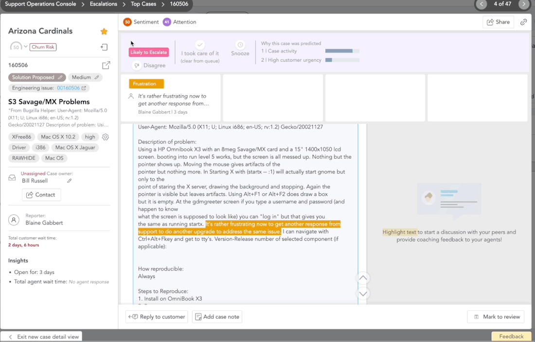
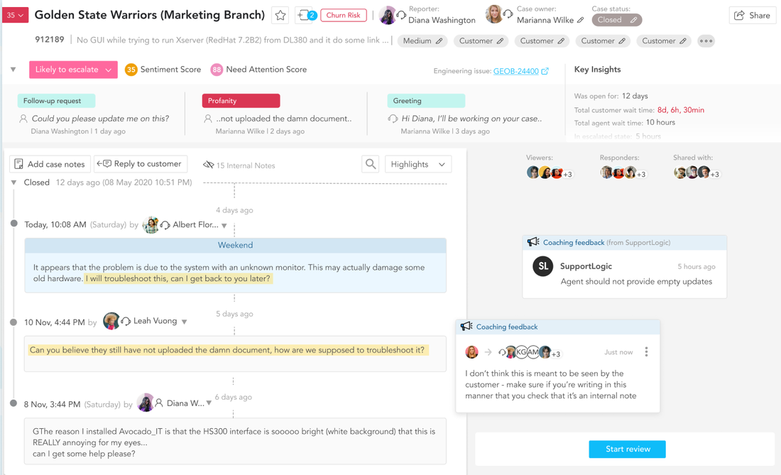
Sr Product Designer Users CS Team Managers, CS Agents and Engineers, Escalation Managers, Business Analysts of IT companies Problem Statement The 'SupportHub' is a case details page, the most visited page within the core product and across other SupportLogic products. Despite its popularity, the backlog housed several issues associated with this page. Concurrently, SupportLogic's other product utilizing the page, AgentSX, was in development, featuring a new React component library. The project presented an opportunity to enhance the page's usability, requiring designs with slightly modified functionality to align with the unique features of AgentSX. |

|
|
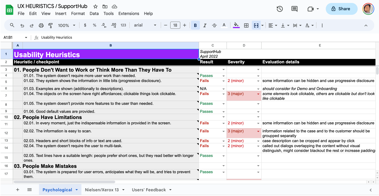
Research Phase
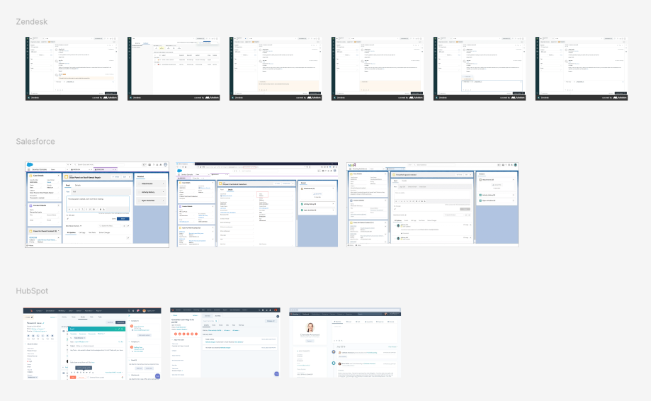
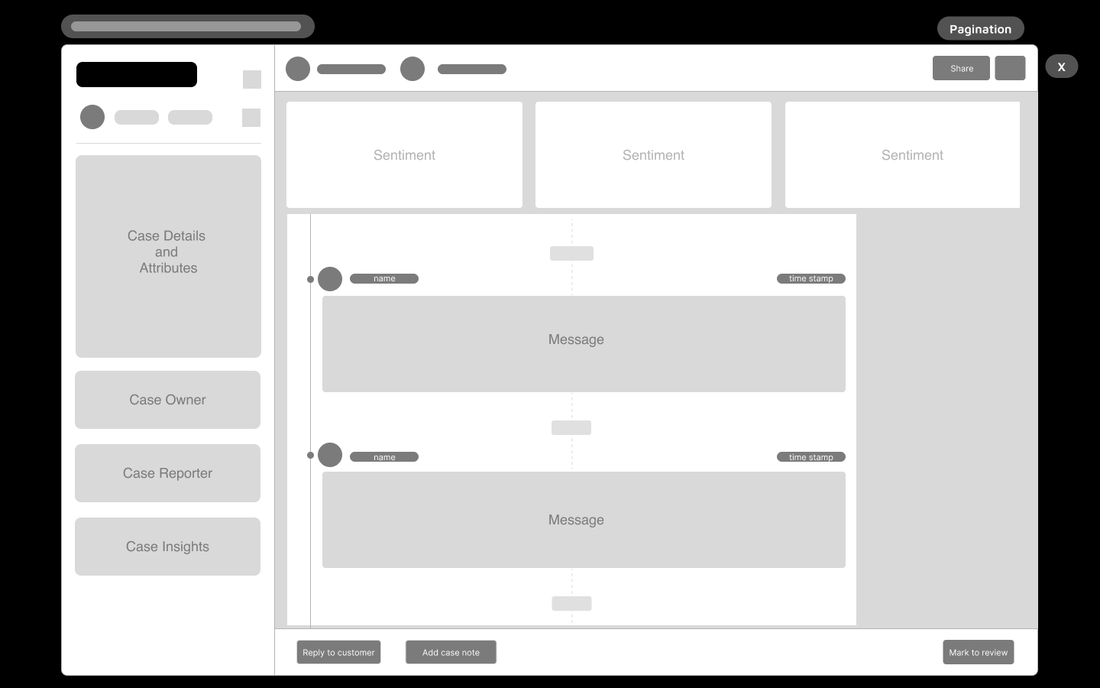
The process began with a heuristic evaluation of the existing page, followed by a comprehensive analysis of usability studies and related issues cataloged in both the user research repository and the backlog. I also analyzed the layout, flows, and interactions of case detail pages of four different CRMs used by SupportLogic clients (Zendesk, Monday, HubSpot, and Salesforce). The page was used by different personas throughout their user journeys and I had to keep that in mind, while finding, analyzing and suggesting solutions for critical issues. Ideation and Conceptualization Once I had brainstormed solutions for each item, I documented the necessary updates as user stories and collaborated with the team to confirm prioritization. Subsequently, I started the redesign process using low-fidelity wireframes, focusing initially on identifying necessary layout changes and components, particularly those not present in the existing library. Since I had two primary personas whose interaction with the page was quite different, I separated those designs into two main use cases. Each case had sub-cases to cover states of the support case (new, not assigned, in progress, closed, etc.) I prioritized higher components that applied to both cases and products, reserving new and advanced features and product-specific elements for future phases. This approach helped effectively manage the workload of the front-end team and gave more time for ideation and fine-tuning of brand-new components. Initially, I conceptualized and developed a low-fidelity wireframe of responsive, adaptable, and scalable layout accommodating two different products. Then, I proceeded with more detailed wireframes for various cases. I gathered feedback on wireframes during design reviews and through Figma collaboration and commenting tools. Prototyping and Usability Testing After iterating on feedback on wireframes, I designed page templates and components covering different use cases in high fidelity. I combined screens according to user stories and connected them into prototypes, which we used for usability testing and demoed to stakeholders and the engineering team to gather the final round of feedback. |
|
Final Design and Visual Elements
In addition to improving page usability, I integrated features of custom case attributes, sentiment acknowledgment, and collaborative efforts within a CS team. As soon as designs were approved, I masked high-fidelity mockups with FPO overlays (for positioning only) so developers could focus only on updated elements, transferred components to the stories, and annotated the designs. I passed the final designs on to the development team during hand-off meetings, and monitored the designated Slack channel for follow-up questions. Implementation and Development I worked on several user stories simultaneously and handed them off to developers as soon as I completed the design work on any of them. This approach helped to distribute the workload evenly and have more control over design implementation and its results. Since the design caters to a wide range of user scenarios involving basic and advanced functionality, I developed a strategy for implementing the changes and meticulously documented the desired enhancements through prioritized user stories, ensuring seamless organization based on dependencies. Altogether, there were ten user stories, and we descoped only a few suggestions marked as 'nice to have'. While the process spanned several development sprints, we successfully orchestrated a seamless transition for existing users. Each group of updates underwent thorough implementation and quality assurance testing before being introduced to the beta version. Evaluation As we were updating the main functionality, we decided to proceed cautiously. We provided an opportunity to try a new layout or switch back to a previous version in the interface itself so as to not interrupt the existing workflow. We also gathered feedback by introducing an on-screen form to SupportLogic users for the first time. We made adjustments based on the received input, and once the response became positive or neutral, we progressed the updates into the alpha environment. To evaluate the success we were also looking into number of users switching back to previous version as well as their qualitative feedback and explanations on why they did so. |
|
|
Challenges and Learnings
|
Outcome
The updated page gathered positive feedback and demonstrated substantial improvements in usage metrics. During usability testing, the tasks were completed in less time. With the alpha version of the update, the team collaboration surged, and there was an increased rate of sentiment acknowledgments, which supported better training of the ML model.
The updated page gathered positive feedback and demonstrated substantial improvements in usage metrics. During usability testing, the tasks were completed in less time. With the alpha version of the update, the team collaboration surged, and there was an increased rate of sentiment acknowledgments, which supported better training of the ML model.
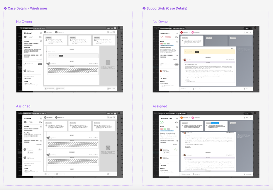
'SupportHub 2.X' before re-design
|
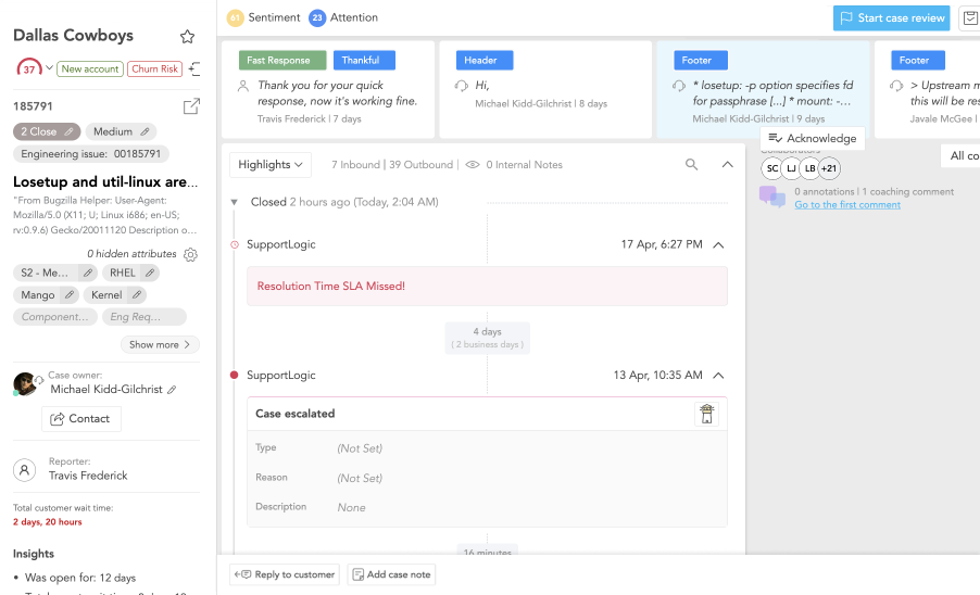
'SupportHub 3.0' after re-design
|
Conclusion
This case study outlines a comprehensive redesign project to enhance the usability of the 'SupportHub' page, a critical page of SupportLogic's products. Through meticulous research, ideation, and prototyping, the project addressed existing issues and incorporated new features to accommodate the unique requirements of the Core and AgentSX products. The iterative process involved wireframes, high-fidelity mockups, prototypes, and usability testing. The implementation phase, guided by prioritized user stories, ensured efficient development and quality assurance. Introducing user feedback mechanisms and cautious roll-out strategies further contributed to the project's success. Despite challenges such as managing multiple projects and navigating the absence of a dedicated product manager, the redesigned page garnered positive feedback. It demonstrated notable improvements in usage metrics, highlighting its positive impact on user experience and team collaboration. This project showcased the effectiveness of cross-team cooperation and emphasized the importance of a strategic approach and iterative design processes in achieving successful product enhancements.
This case study outlines a comprehensive redesign project to enhance the usability of the 'SupportHub' page, a critical page of SupportLogic's products. Through meticulous research, ideation, and prototyping, the project addressed existing issues and incorporated new features to accommodate the unique requirements of the Core and AgentSX products. The iterative process involved wireframes, high-fidelity mockups, prototypes, and usability testing. The implementation phase, guided by prioritized user stories, ensured efficient development and quality assurance. Introducing user feedback mechanisms and cautious roll-out strategies further contributed to the project's success. Despite challenges such as managing multiple projects and navigating the absence of a dedicated product manager, the redesigned page garnered positive feedback. It demonstrated notable improvements in usage metrics, highlighting its positive impact on user experience and team collaboration. This project showcased the effectiveness of cross-team cooperation and emphasized the importance of a strategic approach and iterative design processes in achieving successful product enhancements.