MARIA G VASILIEVA
  • Portfolio
  • About
  • Contact
Picture
February 2017 -- February 2022
At B-Stock, I combined customer research, marketplace strategy, enterprise UX, and platform design to improve buyer trust, seller self-service, and operational efficiency across customer-facing and internal products. My work ranged from monetization and marketplace quality to workflow automation and scalable design-system patterns.​​

FEATURED CASE STUDIES

Illustration for Seller Subscription
Seller Subscription
Illustration for Seller's Rating
Seller Ratings
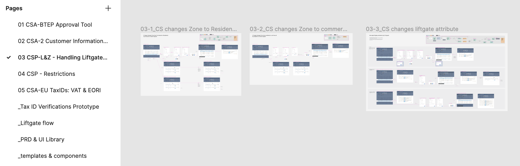
Illustration for CS Portal
Account Approval
Illustration for Filters on Buyer Portal
Scalable Filtering Framework


​


CASE STUDY #1
​Seller Subscription 

Building Self-Service Monetization for B2B Sellers
0→1 Platform Monetization · Complex Account States

DESIGN STRATEGY
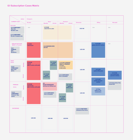
To manage the complexity, I created a user story matrix covering the full subscription lifecycle.
The matrix helped identify:
  • shared steps across flows
  • overlapping states
  • dependencies between billing, account status, and plan management
  • reusable components
  • flows that could be designed in parallel
  • areas that required Product or Engineering clarification
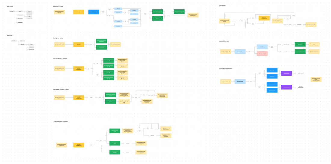
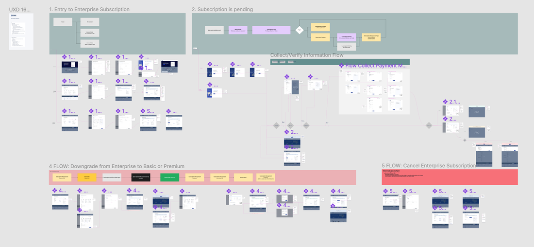
From there, I created detailed flow diagrams (see below) for each major user story before moving into wireframes and high-fidelity design. This helped the team align on the system logic before investing in detailed UI work.
​Role: Lead UX Designer
Users: SMB and enterprise retailers selling on the B-Stock platform
Methods: Competitive analysis, requirements definition, flow mapping, user story matrix, wireframes, prototyping, high-fidelity design, component definition, UX copy, development handoff
Product area: Seller platform, subscription management, billing, account administration
Impact: Improved seller self-service, reduced support dependency, increased customer control, and supported platform monetization.


​PROBLEM STATEMENT
B-Stock needs to transition parts of the seller platform to a subscription-based business model. Before this shift, sellers depended on the Customer Service and Account Management teams to manage subscription-related questions, plan changes, billing issues, and account status updates.
The challenge was to design a self-service subscription system that could support both SMB and enterprise sellers, while handling plan selection, upgrades, downgrades, cancellations, payment methods, transaction history, tax reporting, account suspension, and subscription-related notifications. The solution needed to reduce operational overhead while giving sellers more transparency and control.


MY ROLE

I led the UX strategy and end-to-end design for the subscription experience, from early requirement definition through workflow design, prototyping, high-fidelity mockups, component refinement, UX copy, annotations, and development handoff. I collaborated closely with the Product Manager to define requirements, organize user stories, identify workflow dependencies, and break the work into design tickets aligned with two-week agile design sprints.

Because of the project’s scope, I also delegated selected flows — including payment method updates and account suspension handling — to other designers while maintaining design direction and consistency across the overall experience.
USERS
Primary users 
SMB and enterprise retailers 
Key needs 
→ understand available subscription plans
→ subscribe to a plan
→ switch plans when business needs change
→ cancel, pause, or manage subscription status
→ manage payment methods
→ access transaction history
→ generate tax-related reports
→ understand billing events, payment timing, and account status


Internal stakeholders
Customer Service, Account Management, Finance, Product, and Engineering teams supporting seller operations.
Picture
RESEARCH & ANALYSIS
I began with business requirements and market analysis to understand how subscription models were structured across comparable B2B and B2C products. I analyzed three B2B SaaS subscription flows and two B2C subscription flows to identify reusable patterns around plan comparison, plan selection, payment setup, upgrade and downgrade logic, cancellation flows, billing history, transaction reporting, notification timing, and account suspension states.

This research helped define which patterns could be adapted to the B-Stock seller platform and which areas required custom workflow logic because of enterprise seller needs.
KEY INSIGHTS
The subscription experience was a system of interconnected financial, operational, and account-management workflows. Sellers needed control, but the system also had to account for billing logic, plan states, payment failures, enterprise exceptions, tax reporting, and internal operational dependencies. The design needed to make subscription management feel simple to sellers while supporting complex business rules behind the scenes.
DESIGN STRATEGY
To manage the complexity, I created a user story matrix covering the full subscription lifecycle.
The matrix helped identify:
  • shared steps across flows
  • overlapping states
  • dependencies between billing, account status, and plan management
  • reusable components
  • flows that could be designed in parallel
  • areas that required Product or Engineering clarification
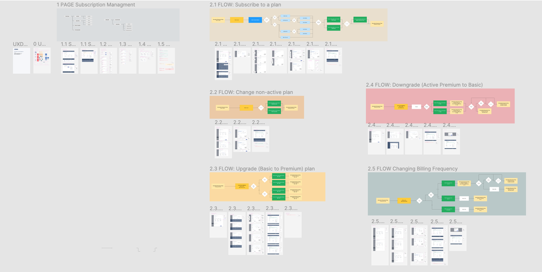
From there, I created detailed flow diagrams (see below) for each major user story before moving into wireframes and high-fidelity design. This helped the team align on the system logic before investing in detailed UI work.
Seller Subscription - Flow Charts
In-scope Flows
SOLUTION
The final design supported a self-service subscription experience with three plan tiers: small, medium, and enterprise. 
I designed the main flows for:
  • subscribing to a plan
  • switching plans
  • canceling and pausing subscriptions
  • managing subscription status
  • viewing transaction history
  • generating tax-related reports
  • understanding of billing events
  • receiving subscription-related notifications
  • handling payment and account-status messaging
The system also included messaging and notifications to inform sellers of upcoming payments, recent subscription activity, billing issues, and account suspension. I introduced a trial period mechanism as part of the concept exploration, but we set it aside for the first phase to reduce complexity and keep the initial release focused.
Seller Subscription - High Fidelity Enterprise Flows
DESIGN EXECUTION
I structured the work into several design tickets and aligned the design process with two-week agile sprints: one sprint for preparation, requirements clarification, and workflow design; three sprints for wireframes, prototyping, high-fidelity design, component refinement, UX copy, and annotations

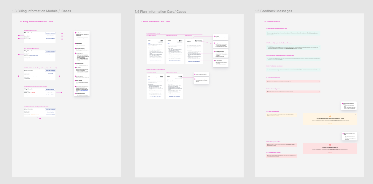
During the transition from wireframes to high-fidelity mockups, I refined interaction details, component states, edge cases, empty states, error states, confirmation messages, and billing-related UX copy. I created prototypes for stakeholder and user feedback, then incorporated minor refinements before preparing annotated designs for Engineering.
Seller Subscription - High Fidelity Main Flows
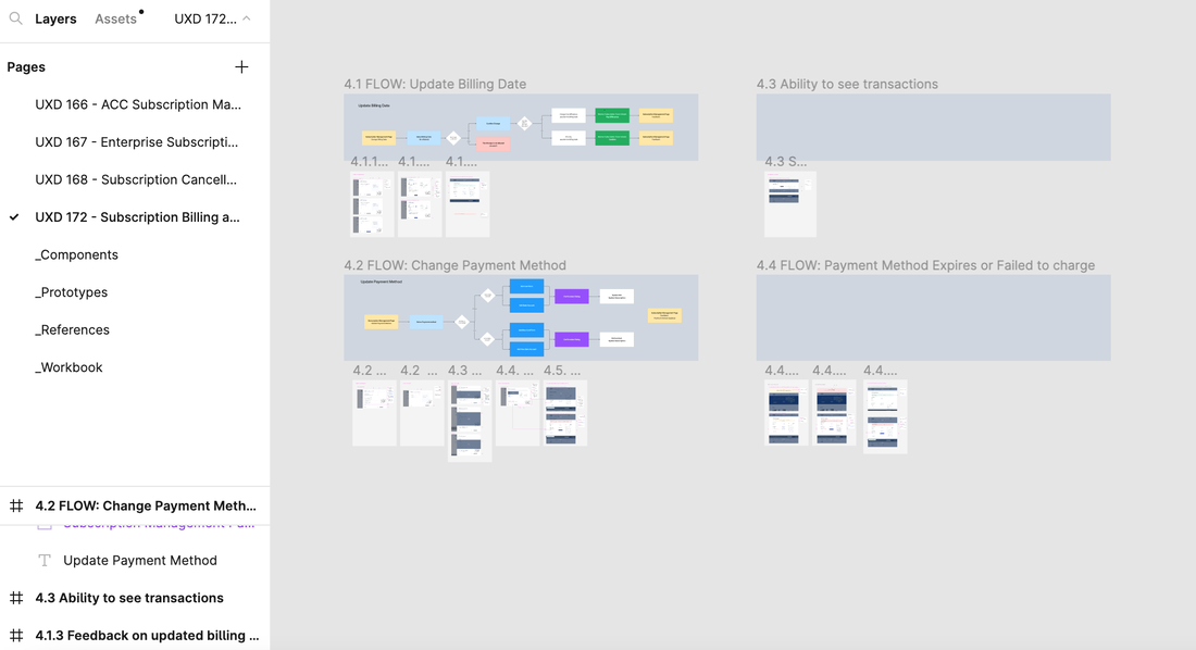
Seller Subscription - High Fidelity Finance Flows
OUTCOMES
​The subscription experience helped B-Stock move toward a more scalable seller monetization model. The work improved seller self-service by giving customers more control over subscription plans, billing information, payment methods, and account-related actions. It also reduced dependency on Customer Service and Account Management teams by allowing sellers to manage common subscription tasks independently. 
​
Reported outcomes included:
→ improved ROI and customer retention
→ reduced time spent on subscription and account-related issues
→ increased seller control over subscription management
→ improved customer satisfaction through clearer self-service workflows
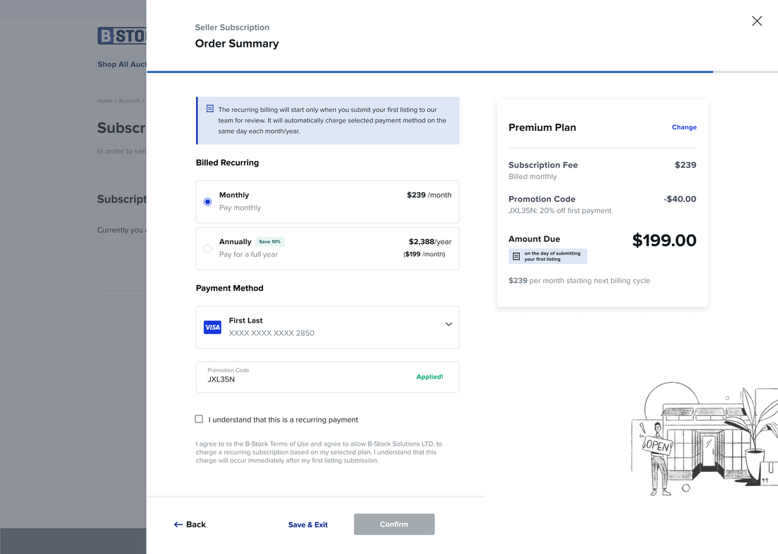
Seller Subscription - High Fidelity Mockup
TAKEAWAY
This project showed how a business model transition can become a complex UX system problem.
The value of the design is not just in creating a subscription flow, but also in structuring the subscription lifecycle as a coherent operational system — connecting seller needs, billing logic, plan states, enterprise exceptions, notifications, internal dependencies, and scalable component patterns into a self-service experience.


CASE STUDY #2
​
Seller’s Rating
Improving Trust and Marketplace Quality
Trust & Measurement · Operational Infrastructure

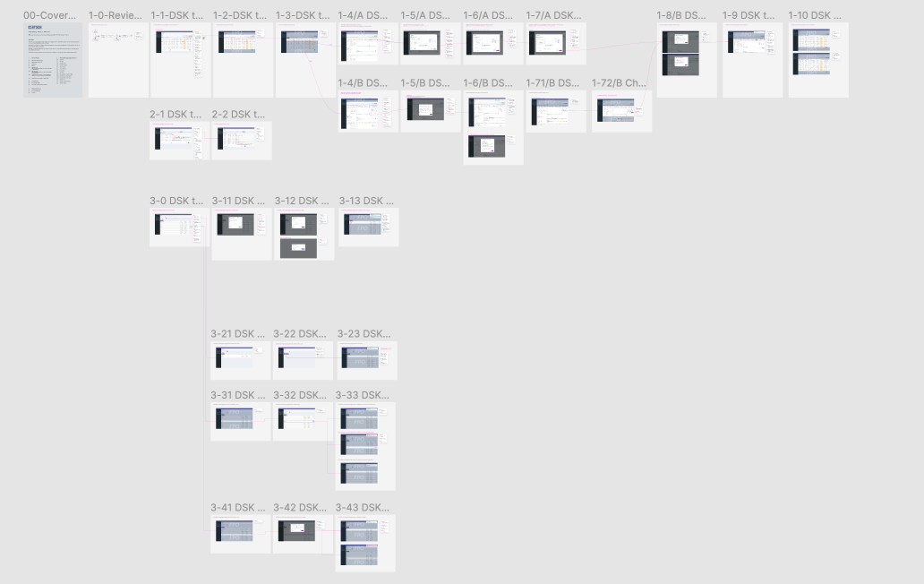
Seller's Rating - Flow Chart
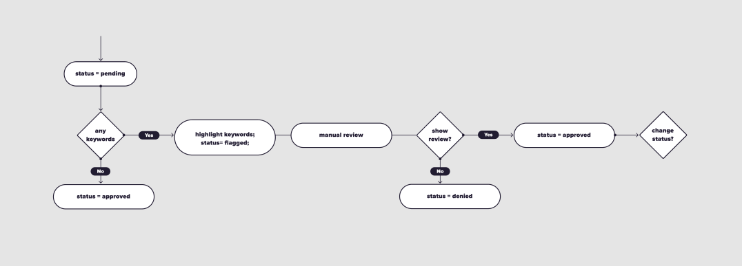
Review Approval Flow
Picture
UX/UI Patterns & Competitive Analysis
Picture
Design for Legacy Product
Picture
Submit Review Flow - Buyer Experience
Picture
'Submit Review' Component
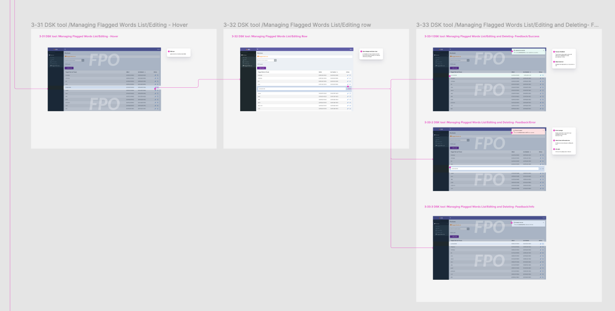
Seller's Rating - Internal Tools - Reviews Management
Reviews Moderation Experience
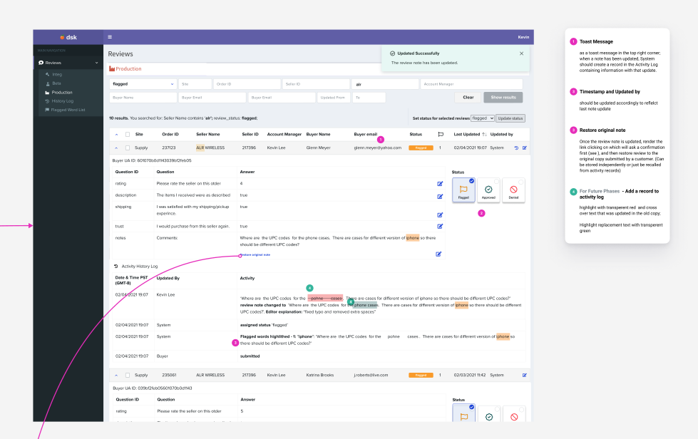
Seller's Rating - Internal tools - High Fidelity Mockup
Hi Fidelity Mockup of Moderator's Experience
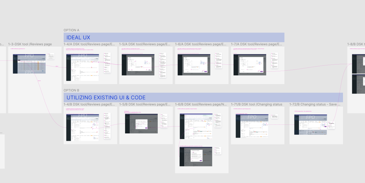
Seller's Rating - Flow Alternatives (Different design options for implementations)
Implementation Options: Ideal UX and Option Based on Existing UI & Code
Role: Lead UX Designer
Users: SMB buyers sourcing inventory on B-Stock; internal review and operations teams
Methods: User Research · Service Design · Workflow Mapping · Prototyping · Mentoring · Cross-functional Collaboration
Impact:
  • 30% increase in repeat buyers for rated sellers
  • 76% reduction in review approval time
  • Lower dispute and order cancellation rates
  • New seller-quality insights for enterprise retailers

PROBLEM STATEMENT
As B-Stock's marketplace grew, buyer trust became a critical challenge. While customers confidently purchased from major retailers, they were often hesitant to buy from smaller sellers due to limited transparency around quality. The platform needed more than a review feature—it required a scalable quality system that could collect trustworthy feedback, establish meaningful seller ratings, support internal moderation, and provide buyers with reliable signals for making purchasing decisions.

MY ROLE
I led UX strategy and experience design for the initiative from discovery through delivery, partnering closely with Product Management, Engineering, Data Analytics, and Marketing.
Beyond designing the buyer experience, I helped define the overall product vision, establish the review lifecycle, map operational workflows, mentor junior designers, and create reusable interaction patterns that could evolve over multiple product releases.


RESEARCH & PRODUCT STRATEGY
The project began with user interviews, survey analysis, marketplace data, stakeholder workshops, and competitive research across leading e-commerce platforms. One of the first challenges was defining what seller quality should actually measure. Poor customer experiences were not always caused by the seller's service or inventory quality. It could also result from shipping carriers, retailer policies, fulfillment facilities, or other operational factors.
Rather than treating ratings as a simple five-star system, we worked to define meaningful quality signals that buyers could trust while providing internal teams with data they could use to improve marketplace operations. This strategic work shaped both the product experience and the supporting operational processes.


DESIGN STRATEGY
Instead of designing an isolated review feature, I approached the project as a complete quality ecosystem.
The strategy focused on:
  • ensuring reviews came only from verified buyers with completed orders
  • designing scalable moderation workflows for internal teams
  • establishing fair quality signals that supported informed purchasing decisions
  • creating reusable interaction patterns and UI components across buyer and internal experiences
  • balancing long-term product vision with incremental delivery and engineering constraints
SOLUTION
The resulting solution introduced verified buyer reviews, seller ratings, sorting and filtering, moderation tools, responsive interfaces, and reusable UI components supporting both enterprise retailers and SMB sellers.
The project also established the operational infrastructure required to collect, moderate, analyze, and surface marketplace quality data for creating a foundation for future experiences, analytics, and product enhancements.
Throughout the project, I worked closely with engineering to provide options that balanced ideal user experience with technical constraints and development effort.

​
OUTCOMES
The new marketplace quality system strengthened buyer confidence while significantly improving operational efficiency.
The initiative resulted in:
  • 30% increase in repeat customers for rated sellers
  • 76% reduction in moderation time
  • Decreased order cancellations and disputes
  • Actionable quality insights for individual sellers and fulfillment facilities
  • A scalable foundation for future buyer and seller experience​​​

TAKEAWAY
This project demonstrated that designing trust for a two-sided marketplace requires much more than collecting reviews. By combining research, product strategy, operational workflow design, and scalable UX patterns, we created a quality system that benefited buyers, internal teams, and the long-term evolution.


CASE STUDY #3
Account Approval
Automating Customer Support Portal Supporting Complex Exceptions​
Workflow Automation · Human-in-the-Loop

Role: Lead UX Designer
Users: B-Stock Customer Service team members and internal operations employees
Methods: Workflow review, focus group, requirements refinement, flow mapping, wireframes, high-fidelity design, prototyping, usability testing, design annotation, development handoff
Product area: Customer Support Portal, account approval, internal tools, operational workflows
Impact: Reduced manual approval time, decreased wait time for buyers, improved approval quality, reduced human error, and created a more efficient interface for remaining manual cases.


PROBLEM STATEMENT
B-Stock introduced a new customer registration process that changed how account approvals were handled by the Customer Service team. The product team planned to automate a major part of the approval cases, but some edge cases still required manual review or documentation validation. The challenge was to redesign the approval workflow so automated cases could move through the system efficiently, while giving CS team members a clear, reliable interface for reviewing and approving the remaining manual cases.
USERS
Primary users:
Customer Service team members who are reviewing and approving buyer accounts.
Secondary users:
Internal operations teams supporting customers' onboarding and compliance-related workflows.
Indirect users:
B-Stock buyers are waiting for account approval before they can use the platform.


MY ROLE
I led the UX design for the manual approval experience inside the Customer Support Portal.
My work included reviewing existing process documentation, conducting a focus group with CS team members, refining product requirements, mapping the approval workflow, designing the manual review interface, prototyping the flow, conducting usability testing, and preparing annotated designs for development.
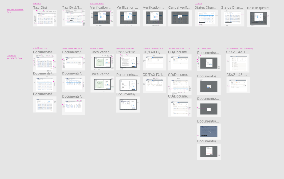
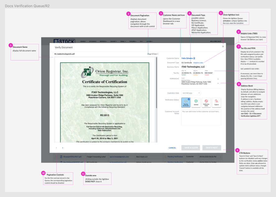
CS Portal - Internal Tools - Document Approval Dialog Mockup in High Fidelity
CS Portal - Internal Tools - Approval Flow in High Fidelity
RESEARCH & DISCOVERY
I began by reviewing existing materials, reports, and operational observations prepared by the Product Manager, who had closely studied the Customer Service team’s approval process.
To clarify open questions and capture frontline context, I organized a one-hour focus group with CS team members.
The session helped identify:
→ which cases could be automated
→ which cases still require manual approval
→ what information CS needed to make decisions
→ where documentation was required
→ where errors or delays could occur
→ what would reduce training time for new team members
These insights helped refine the product requirements and shaped the design of the manual review workflow.


KEY INSIGHTS
The goal was to automate predictable cases while designing a stronger decision-support experience for the exceptions. For the remaining manual cases, CS team members needed fast access to the right data, supporting documents, validation status, and approval actions in the same workflow.
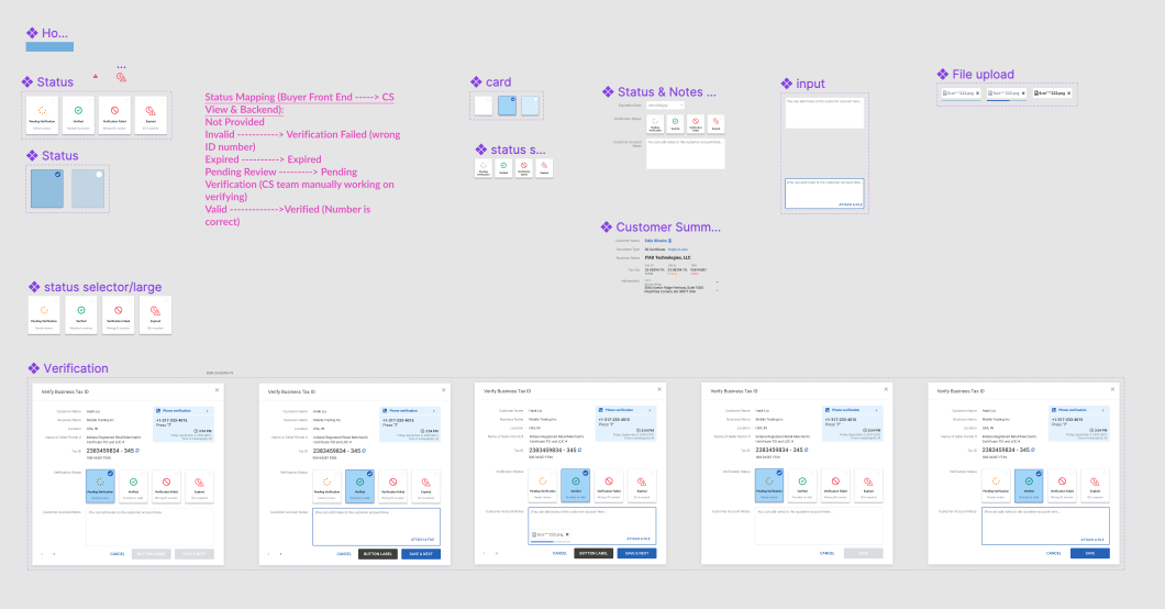
CS Portal - Internal Tools - Approval Flow Components
CS Portal - Internal Tools - Flows for CS Portal
PROTOTYPING & USABILITY VALIDATION
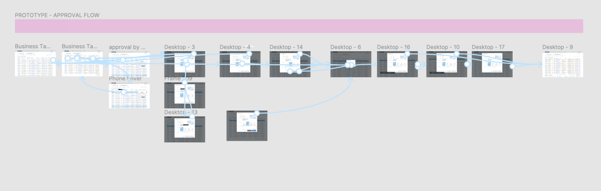
After wireframes were approved, I created high-fidelity screens and a prototype of the approval flow.
I conducted independent usability tests with two CS team members to validate the workflow, information hierarchy, and decision-making experience.
Feedback from testing helped refine the interface before the final handoff.


DESIGN HANDOFF
After validation, I annotated the designs and prepared the flow for handoff, which included:
→ high-fidelity screens
→ approval flow behavior
→ component states
→ document review dialog behavior
→ interaction details
→ annotations for development
This helped Engineering implement the new manual approval experience with a clear understanding of the workflow and expected behavior.
CS Portal - Internal Tools - Approval Flow Prototype in High Fidelity
OUTCOMES
The new approval system improved both automation and manual review efficiency:
→ automated approval for approximately 80% of cases
→ reduced time required per approval
→ reduced approval wait time for buyers
→ improved quality of approved customers through automated validation
→ reduced risk of human error
→ created a record of approval decisions
→ improved CS efficiency for remaining manual cases
→ reduced training time for new CS team members
The CS team gained a modern internal tool for handling exception cases with faster access to relevant information and supporting documentation.


TAKEAWAY
This project showed how automation and human decision-making can work together in operational UX.
The strongest value came from designing the boundary between automated validation and manual review: predictable cases moved faster, while CS team members received a clearer decision-support interface for complex exceptions.


​


CASE STUDY #4
Filtering Framework
Creating a Scalable Pattern Across a B2B Marketplace
Platform Pattern · Design System

Role: UX Designer
Users: SMB retailers, enterprise sellers, B-Stock internal employees, and third-party vendors
Methods: UX audit, touchpoint inventory, best-practice research, analytics review, mobile-first design, component design, responsive mockups, design system documentation
Product area: Marketplace filtering, internal tools, design system, responsive web patterns
Impact: Improved usability and discoverability of filtering controls while creating a reusable pattern for future product work.


PROBLEM STATEMENT
During a heuristic analysis, non-listing page filters were identified as having low usability, poor discoverability, and outdated UI patterns. At the same time, new pages required additional filter attributes and more flexible filtering behavior. The challenge was to create a scalable filtering pattern that could support multiple products, data types, screen sizes, and user groups while becoming part of the B-Stock Design System.

USERS
The filtering pattern needed to support several user groups across the platform:
  • SMB retailers sourcing inventory
  • enterprise sellers managing marketplace workflows
  • internal B-Stock employees using operational tools
  • third-party vendors interacting with platform workflows
Because these users worked across different pages and contexts, the pattern needed to be flexible enough for multiple use cases without creating inconsistent UI behavior.

RESEARCH & ANALYSIS
I started by revising the inventory of all pages using the existing filtering UI. This helped identify UX touchpoints, repeated patterns, inconsistencies, and opportunities for consolidation. I then researched e-commerce filtering best practices, using Baymard Institute research, and applied relevant recommendations to the B2B marketplace context.
To support filter prioritization, I reviewed web analytics data showing how existing filters were used. This helped inform the initial ordering of filter options, while I also identified areas that would need future validation.


KEY INSIGHTS
Filtering was not just a local page-level interaction, but a platform pattern.
Because filtering behavior appeared across multiple product areas, the design needed to solve both immediate usability problems and long-term system consistency. The goal was not only to redesign filters for one page, but to create a reusable framework that future teams could apply across products.
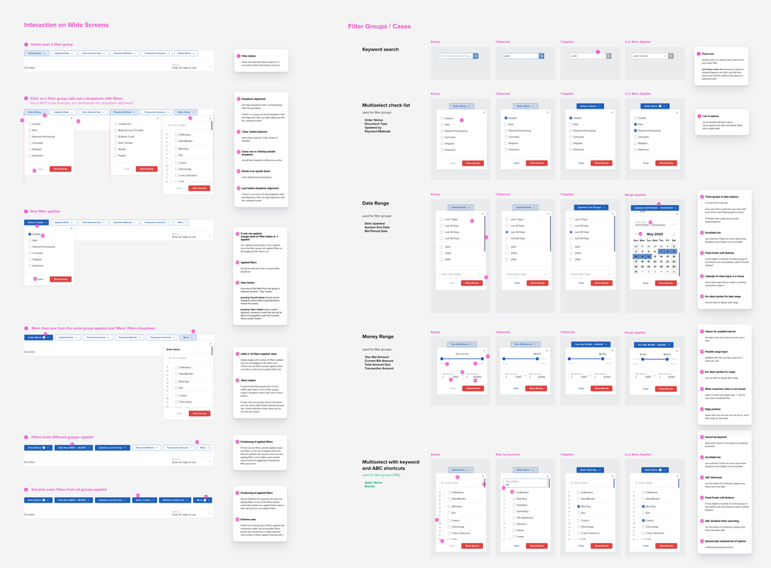
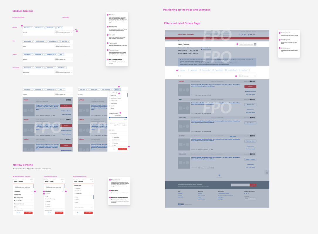
Buyer Portal - Filters - High Fidelity Deliverables
DESIGN STRATEGY
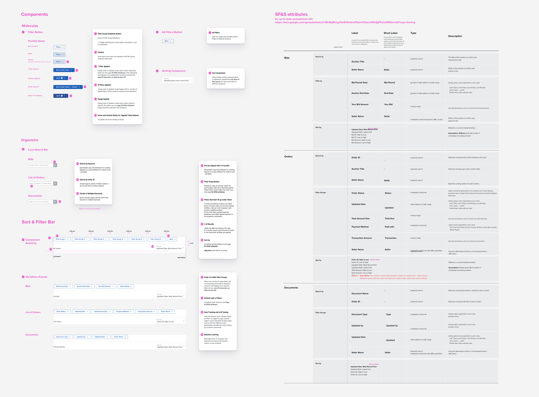
I designed the pattern using a mobile-first approach and created responsive solutions for both narrow and wide screen layouts. To make the system flexible, I used a matrix to map data cases and filtering behaviors across pages. The matrix helped define: filter sections,  filter option types, data types, labeling conventions, sorting behavior, applied-filter states, responsive behavior, and reusable component requirements. I also presented early solution drafts to the design team to collect feedback, align on direction, and improve pattern consistency before finalizing components.


Buyer Portal - Filters - Components
SOLUTION
The final solution included updated filtering patterns for all relevant pages and product contexts.
I designed and documented:
  • filter sections
  • filter option behaviors
  • UI patterns for different data types
  • labeling conventions
  • filter ordering recommendations
  • applied-filter states
  • responsive layouts for narrow and wide screens
  • reusable components for the B-Stock Design System
  • guidelines for future product work
The design provided a consistent filtering experience across multiple areas of the platform while allowing enough flexibility for different page types and data structures.
Buyer Portal - Filters - High Fidelity Components and Mockup
OUTCOME
​
The updated filtering pattern improved usability, discoverability, and consistency across B-Stock’s platform. It also gave the design and product teams a reusable Design System pattern that could support new pages, additional attributes, and future workflows.

TAKEAWAY
This project showed how a small UI pattern can become an important platform-level design system decision. By auditing touchpoints, researching best practices, reviewing usage data, and designing flexible components, the work turned a fragmented filtering experience into a scalable pattern for future marketplace and internal tool design.
< SupportLogic
GOPRO KARMA DRONE >
© 2012-2026 Maria G Vasilieva
  • Portfolio
  • About
  • Contact